PETSCII editors – design thoughts
April 6th, 2016
After more than two years of improving and honing my own project, and checking the competition I got the urge to share some of my thoughts on what makes or breaks a PETSCII editor. A lot of this stuff is actually pretty self-evident in the end, but it has taken hours and hours to figure it out. Bear with me 🙂
Not pixels
When comparing a PETSCII editor to a generic paint program there are plenty of similarities, but also notable differences. Instead of tens of thousands of individual pixels we’re dealing with a relatively low-resolution grid consisting of predefined symbols. On the one hand it is easier to deal with text, since tools such as lines, ellipses and curves are rather useless, but on the other hand there is a constant need to effectively choose and alternate between the available symbols, which requires different kind of thinking altogether. In other words, adopting tried and tested methods from paint programs alone will not lead to optimal outcome.
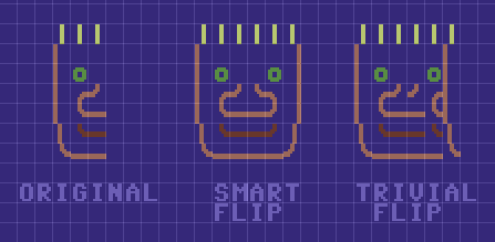
Among the most powerful features of PETSCII (the editor) are smart rotation and flipping of a selected area which take into account the form of the character. I take no credit for these, as it was Tero who came up with the idea in the first place and wrote the remapping tables. Not every character can be rotated or flipped, but even so you’ll save a lot of time when working with symmetric forms. See the following image for an example of how “smart” flipping works as opposed to simply moving the characters:
Typing vs. drawing
In essence there are two main methods to get characters on the screen. The traditional way, typing, was initially the only possible option and is still heavily present in modern-day editors (for example AAE). A mouse is something of a rarity on C-64s and graphical symbols can be conveniently found on the keys, so on a real machine typing makes all sense – but a lot less so on your PC or Mac which has a different keyboard to begin with.
I’ve included a half-assed typing mode in PETSCII, mostly for the sake of actually writing text, even though all the symbols can be typed too if it’s really necessary. In any case, drawing with a mouse was the preferred metaphor right from the beginning. There are pros and cons to both, but using a mouse definitely makes it quicker to sketch forms in the spirit of direct manipulation. A little but important detail is to show the character before it is actually placed: otherwise you end up constantly undoing the operation.
Character selection
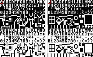
When drawing, a great deal of time is spent on selecting the next character. The first thing to do was to reorganize the otherwise messy character set to group related symbols together (thanks go to Tero again). Jambonbill went even further and repeated the same characters multiple times to create visually continuous groups.
A well-organized character selector is a good start, but much more can be done to facilitate an efficient workflow. For example in PETSCII the aforementioned rotate and flip operations work with individual characters as well: press a single key and get the next corner for a window or a box. In the same lines I came up with “smart sets”, predefined sets that you can walk through with a keypress. Another little bit that arose from a real need was to let the user quickly shift stick characters (used for various lines) right/left/up/down.
As a piece of PETSCII art is drawn, you typically start accumulating useful characters and their combinations in the image itself. Instead of always going for the selector – which in Playscii even occludes part of the canvas – it makes sense to quickly pick a character from the surroundings.
Grid
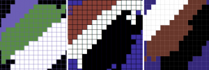
You can get away without a grid if the images are comparably small, but all in all a well-working grid can be of great benefit when selecting regions and aligning symbols with each other. After at least three complete rewrites of the drawing code I’ve eventually come up with the following findings:
- Don’t make the grid intrusive (thick, contrasty etc.)
- No single color works for the grid alone. Instead, darken light colors and lighten dark colors to keep it harmonious.
- It’s useful to have a quick on/off toggle
Below a few real-life examples of how the grid looks like in different editors.
File formats
The file formats supported by an editor tend to reveal its intended use. Some editors are clearly geared toward actual machines, stick to their limitations and facilitate easy exporting to formats like .prg, which can be run on real hardware. At the other end of the spectrum you might get only PNG files or GIF animations out for easy distribution on the web.
I’ve been balancing between the two extremes myself: initially the idea was to support software development and participate in demoscene competitions. However, it soon became evident that many people needed and wanted to distribute their works online for easy viewing, so I had to give in and add a PNG exporter. Supporting multiple exporters for multiple machines obviously means plenty of error-prone extra work.
Automatically converting existing images to PETSCII is a different discussion altogether. Having said that, many users would welcome such a feature for, say, converting their self-portrait into retro character art. In addition, an artist can benefit from a reference image, as some of them prefer sketching on paper first before firing up the actual editor.
Animation and other fancy features
Creating proper support for animation is probably as big a task as all the others combined. As of now there are animation features in multiple editors, but none of them really go beyond simple copy/paste and playback of the frames. Think of a proper video or animation editor to realize how many possible features there could be.
Undo and redo aren’t exactly “fancy” features from a user perspective, but it takes some effort to include them in your editor. It’s definitely a good idea to implement them early on, as adding them as an afterthought might prove painful – speaking from experience 🙂 There are more and less sophisticated ways to go about undo, but as we’re dealing with quite little data it’s not all that bad to just save the buffers between operations for undoing or repeating the steps. Another welcome safety network comes in the form of automated backups.
There are a couple of editors that support layers, approximately in the lines of your familiar photo editing software. I can definitely see some uses for them, for example for separating the background from foreground figures. Then again, to fully support layers requires considerable effort, and they aren’t quite as useful as in photo editing, as you can’t really have things like translucency or color manipulation.
Accessibility
While some users are after a genuine user experience – tapping away on a real C-64 – most seem to welcome the ease of cross-development. Supporting the three main desktop platforms (plus their different flavors) is tedious at best, and thus some of the editors run on Windows only. Being a Mac/Linux user myself this was, of course, out of the question, but luckily Processing lets you export multiplatform applications with little extra effort. On the downside, Java is required on the target machine, which will turn off some possible users (and rightfully so).
As I see it, the best bet these days would be to develop for the web. In spite of the possible troubles with browser compatibility, web applications tend to be multiplatform by nature. In addition, you don’t need to go through the trouble of installing anything on the local computer. If I were to start from scratch, I’d probably take this route. As of now there are two online editors already, even if neither of them is quite complete yet (see my previous post).
Another angle to accessibility follows from the fact that people use laptops and tablets with a crammed keyboard. Therefore, relying on numpad or function keys beyond F10 is obviously out. Likewise, touch pads (esp. Apple ones) might not have more than one or two mouse buttons available, which requires some thought. Even more so for touch screens, which again introduce a new set of challenges.
Documentation
I can wholeheartedly relate to programmers that want to spend their free time on interesting coding problems instead of writing documentation. Even if it’s not exactly fun, there is a need for at least some product support: be it a manual, online help or a website. A few nice example works done with the editor definitely don’t hurt, as they show what’s possible and spark user interest.
Conclusion
Cross-development tools for PETSCII are a surprisingly new phenomenon. As far as I know, they’ve been around for not much more than five years, after which things have really started picking up speed. The threshold of starting to do character art has probably never been lower, and new authors are popping up every now and then.
All in all, the challenge of programming a PETSCII editor is twofold: there’s the tech and then there are the users. It’s not hard to put together basic minimum functionality, but going beyond that has turned out so laborious that most projects have been abandoned shortly after their initial release. PETSCII too would require quite an overhaul by now to accommodate any new major features – feature requests are, of course, neverending.
Implementing new modes, tools and so on is one thing, but thinking about the workflow and making the features useful is another. If you’re not much of an artist yourself, it’s at least good to have one in the loop: user feedback or even going so far as to observe someone’s work over their shoulder provide valuable insight and motivation. Ok ok, that was the design teacher in me speaking 🙂
Filed under: demoskene,filosofointi,koodi,retro,softat


2 Comments Add your own
1. wysiwtf | May 17th, 2016 at 3:24 pm
First of all thanks again for your PETSCII-Tool, I use it for almost 2 years now and even if Im not that good of an artist than most of the other petscii sceners its a lot of fun!
What I’m looking for as a feature or seperate tool is a convinient way to “paint” directory listings for d64 images and similar taking all the little resttrictions (like no colors, 16 chars max and a reduced charset” into account. Of course it would be awesome to have it as a feature in PETSCII but if there already is one I wouldnt mind using that.
Any ideas?
2. marq | May 17th, 2016 at 3:27 pm
I’ve come across some directory editors, but don’t remember their names anymore. Directory editing has been requested at times and it is indeed on my todo list, but unfortunately not with very high priority 🙂 It’d require some internal changes to be implemented.
Kommentin kirjoitus
You must be logged in to post a comment.
RSS feed for comments on this post.